Skip to content

sprezzature-figures · Case Study

Tribute to Hans Rosling

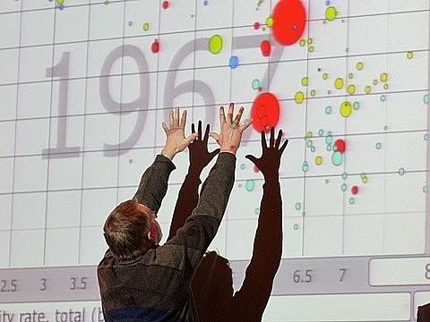
Hans Rosling turned a bubble chart into a story the whole world could feel.

Best seen in landscape. Tap ↗ for fullscreen, then pinch to zoom.

Wealth & Child Survival

Animated bubble chart of GDP per capita versus child survival for every country, one frame per year from 1950 to 2025, bubbles sized by population and coloured by region, sweeping up and to the right as wealth and survival rise together.
1950
Speed Jump to

Wealth & Health

Animated bubble chart of income versus life expectancy for every country, one frame per year from 1950 to 2025, bubbles sized by population and coloured by region, sweeping up and to the right over time.
1950
Speed Jump to

Fertility and Life Expectancy

Animated bubble chart of children per woman versus life expectancy for every country, one frame per year from 1950 to 2025, bubbles sized by population and coloured by region, moving from many children and short lives toward few children and long lives.
1950
Speed Jump to